

Background
When collaborating with others on a react project, we create components so that we could reuse it again and again. However, it is quite difficult to know what does it look like for components that created from other so at the end we might be creating duplicated components. On top of that, sometimes, when we revisit our own project, we might also forget the design of our own components too.
To solve that, we want an environment where we could view all the components and are able to interact with it using different props value.
Storybook could help in this case. In this article, we will demonstrate how to setup a simple storybook and deploy it to chromatic so that your teammate could access via a link.
Project Tech Stack
- React
- Vite
- Bootstrap
- SCSS
Step by Step Guidelines
Step 1 - Install Storybook
1. In your existing react project, type in below command in your terminal
1npm create storybook@latestNotes: You do not need to create a new repo or new react project. If you have an existing react project, please install it in the existing project.
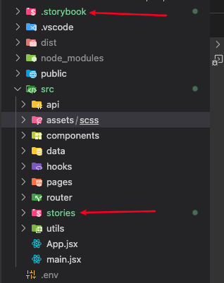
2. After installing the storybook, you will see two new folders, ".storybook" and "stories", are being added to your project
- ".storybook" is for configuration (e.g. import css file etc)
- "stories" is for displaying your components
3. After installing the storybook, a "localhost:6006" page will be opened and on the screen you will see the sample of storybook. You are able to see these because it has added some sample stories inside the "stories" folder
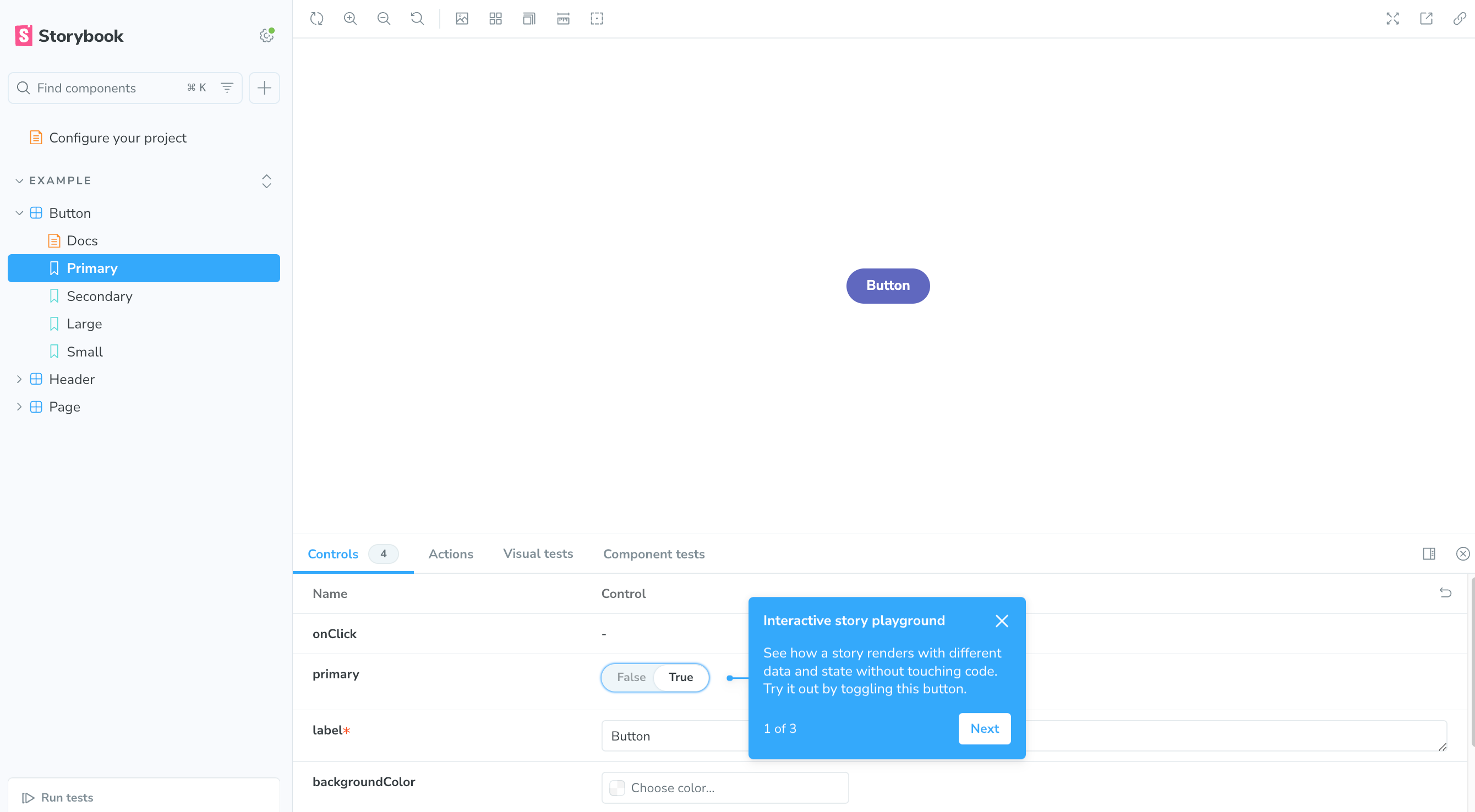
Those files end with ".stories.js" are used to display on the Storybook screen. The remaining files are just used to create a normal react component.
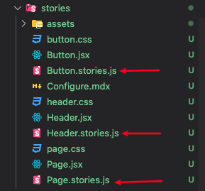
4. Remove all the file and folder inside the `stories` folder as we want to create stories for our own components.
Step 2 - Import Existing Styles to Storybook
1. Add material icons
- Since we are using material icons for displaying icons on the react project, we need to also import it to storybook.
- To import material icons, create a new file ”preview-head.html“ inside the “.storybook” folder and add the material icons stylesheet link inside.
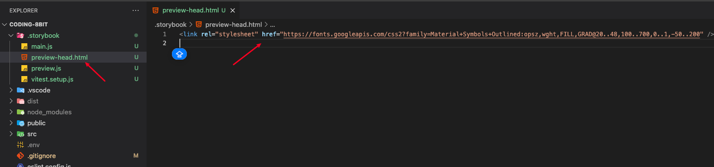
1<link rel="stylesheet" href="https://fonts.googleapis.com/css2?family=Material+Symbols+Outlined:opsz,wght,FILL,GRAD@20..48,100..700,0..1,-50..200" />2. Import existing styles file
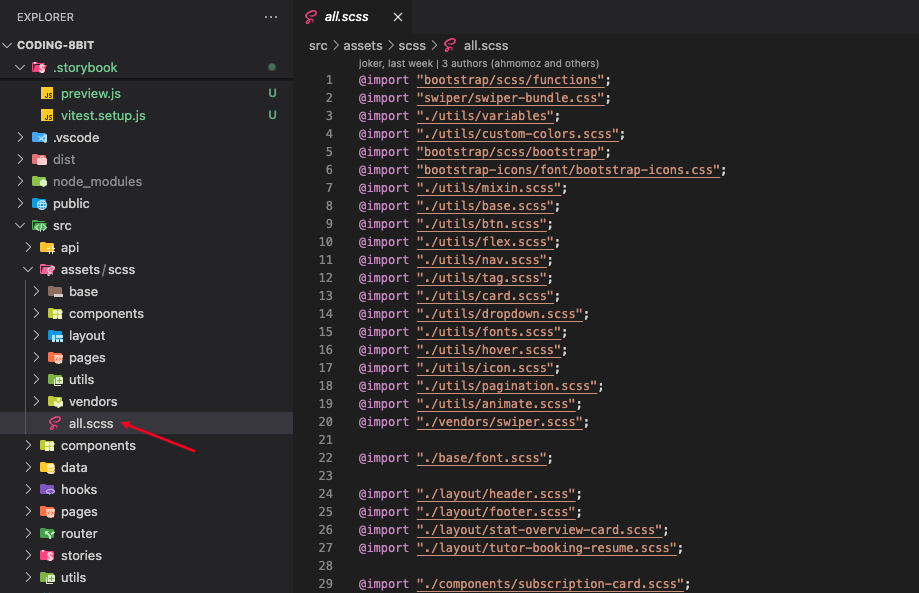
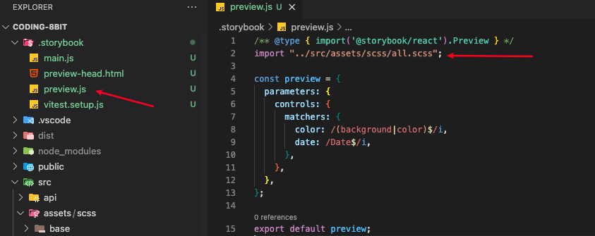
In our react project, we used an `all.scss` to import all the scss file we had so we could just include this file in the `preview.js` file inside the `.storybook` folder
In order for the scss to work with storybook, we need to install a new package, so please type the below command in terminal.
1npx storybook@latest add @storybook/addon-styling-webpackStep 3 - Create a story for a component
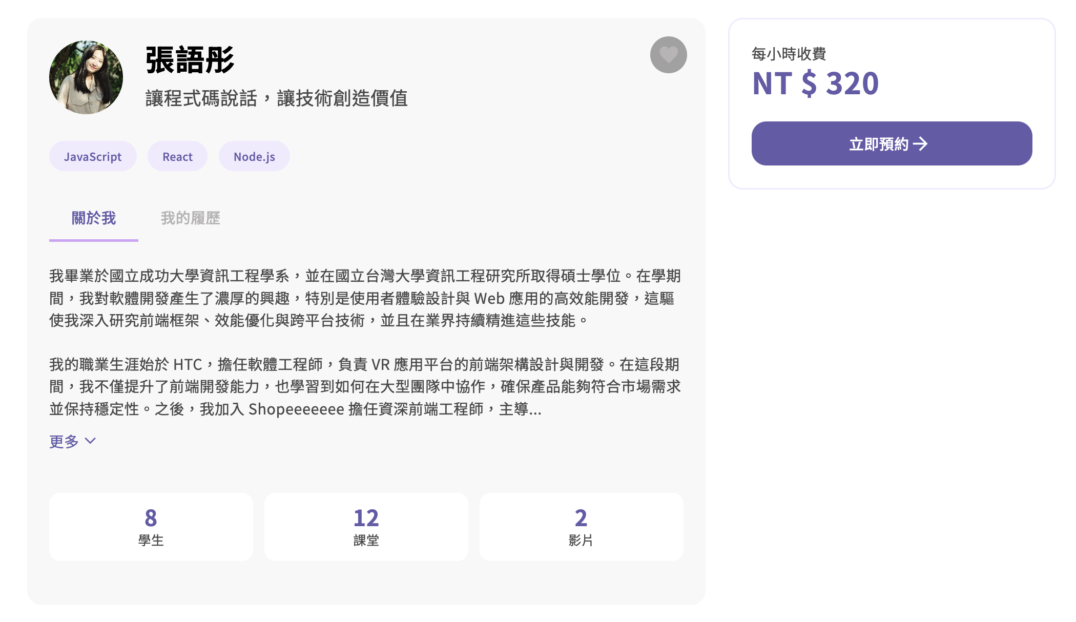
We will create a story for the below component. It is a show more button, when the text exceed the maximum character, the exceeded character will be trimmed and a ”更多” (i.e. Show More” text will appear).
This is the script of the component. In this case, I would like to demonstrate how does it look like when the text exceed the maximum characters as well as when the text doesn’t exceed the limit.
1import { useState } from "react";
2
3import PropTypes from "prop-types";
4
5export default function ShowMoreBtn({ text, initialShow = false, maxCharacter = 250 }) {
6 const [isShow, setIsShow] = useState(initialShow);
7
8 const handleClick = () => {
9 setIsShow((prevIsShow) => !prevIsShow);
10 };
11
12 const displayedText = isShow ? text : text.length > maxCharacter ? text.slice(0, maxCharacter) + "..." : text;
13
14 return (
15 <>
16 {displayedText
17 .replace(/\\n/g, "\n")
18 .split("\n")
19 .map((line, index) => (
20 <p key={index} className="tab-details">
21 {line}
22 <br></br>
23 </p>
24 ))}
25 {text.length > maxCharacter && (
26 <div className="d-flex align-items-center py-3" role="button" onClick={handleClick}>
27 <p className="text-brand-03">{isShow ? "更少" : "更多"}</p>
28 <span className="material-symbols-outlined icon-fill text-brand-03 align-middle">{isShow ? "keyboard_arrow_up" : "expand_more"}</span>
29 </div>
30 )}
31 </>
32 );
33 }
34 ShowMoreBtn.propTypes = {
35 text: PropTypes.string,
36 initialShow: PropTypes.bool,
37 maxCharacter: PropTypes.number,
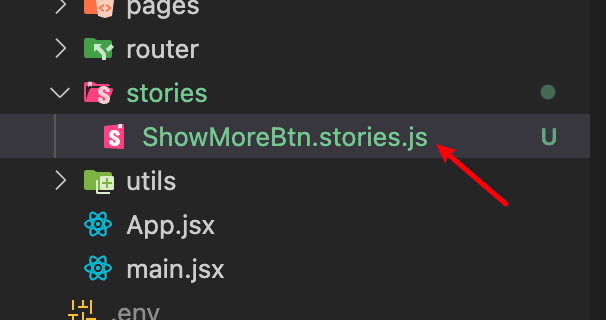
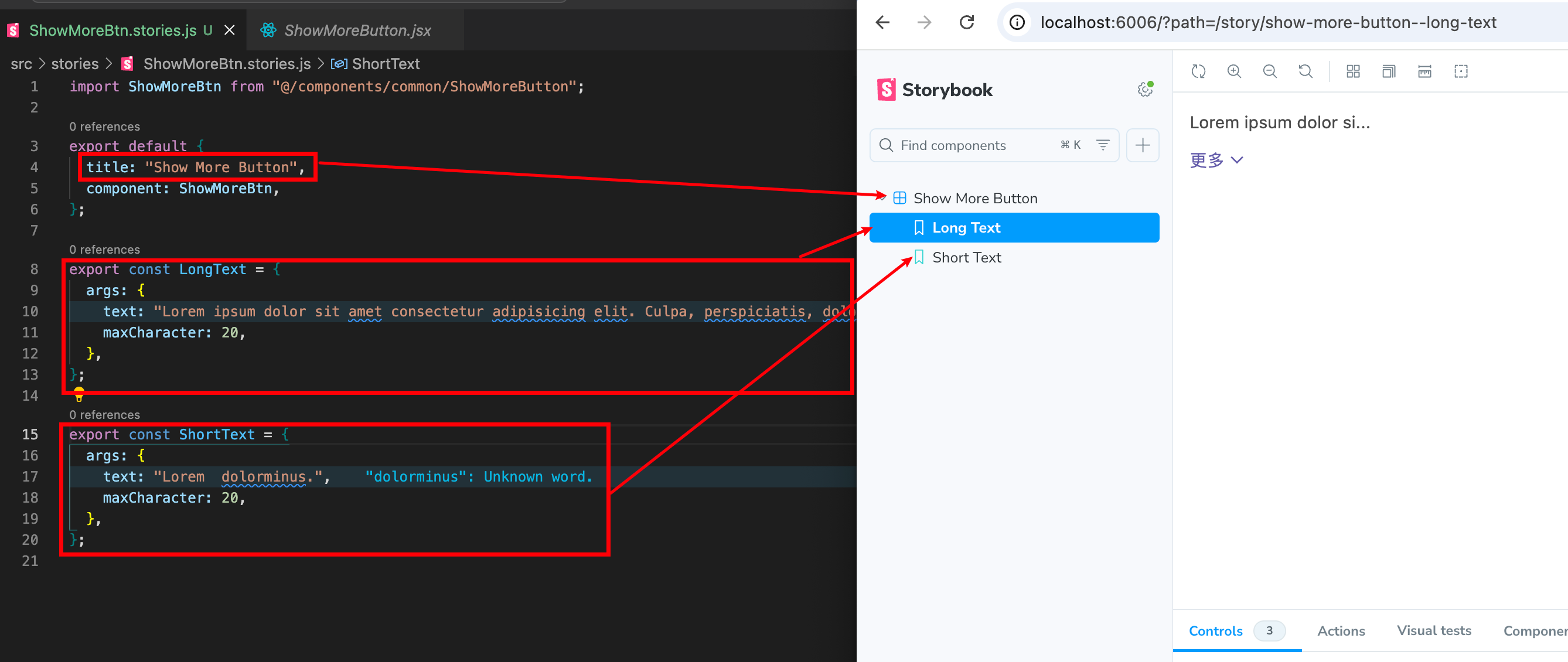
38 };1. Create a `ShowMoreBtn.stories.js` inside the `stories` folder
2. Import your component and give the story a title
3. Define your case by providing different arguments. “text” and “maxCharacter” are the props of the original component.
1import ShowMoreBtn from "@/components/common/ShowMoreButton";
2
3//Import your component and give the story a title
4export default {
5  title: "Show More Button",
6  component: ShowMoreBtn,
7};
8
9//Define different case below
10export const LongText = {
11    args: {
12        text: "Lorem ipsum dolor sit amet consectetur adipisicing elit. Culpa, perspiciatis, dolore corrupti dolores obcaecati officia molestiae atque iusto animi doloremque saepe sit eveniet hic ex amet consectetur iste, ipsam minus.",
13        maxCharacter: 20,
14      },
15};
16
17export const ShortText = {
18      args: {
19        text: "Lorem  dolorminus.",
20        maxCharacter: 20,
21      },
22};
4. Open the storybook by typing "npm run storybook". You are able to see your case in your storybook.
5. You could interact with your case inside the canvas. You could also adjust the control to test with different situation. For example, I could set the maxCharacter to 100 directly in the control UI.
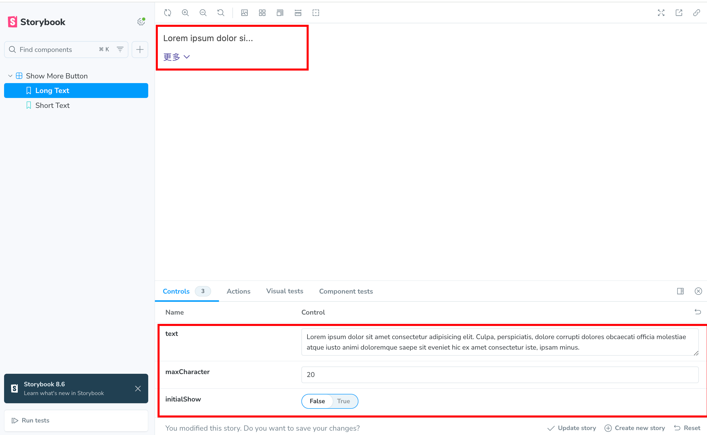
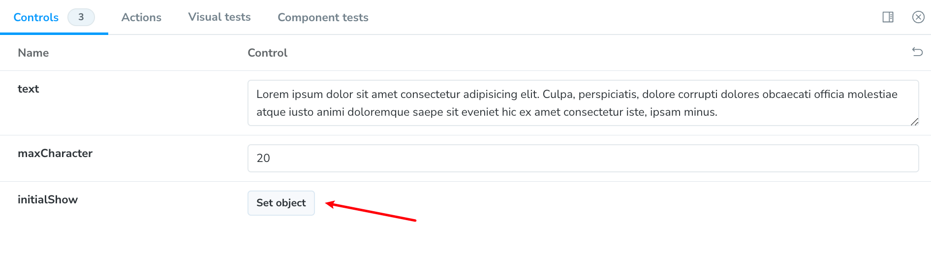
Tips: Setting the propTypes to your component could help storybook to understand the type and provide with the correct control to you. For example, in my original component, I have set `initialShow` as boolean in propTypes so it will show false or true in the storybook control. If you do not provide, it will become set object. It is useful if you have already defined specific word for the props e.g. different sizes for button.
Step 4 - Deploy the storybook to chromatic
Now you have your story and we could deploy it to chromatic.
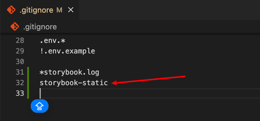
1. Export storybook as static app by typing "npm run build-storybook" in the terminal. You will see a new folder called "storybook-static" being generated.
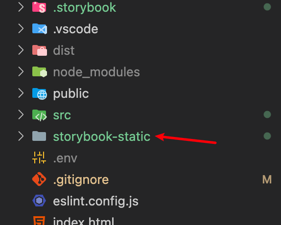
2. Add "storybook-static" in the "gitignore" file as we do not want to push this storybook-static on the github same as the "node_modules" folder
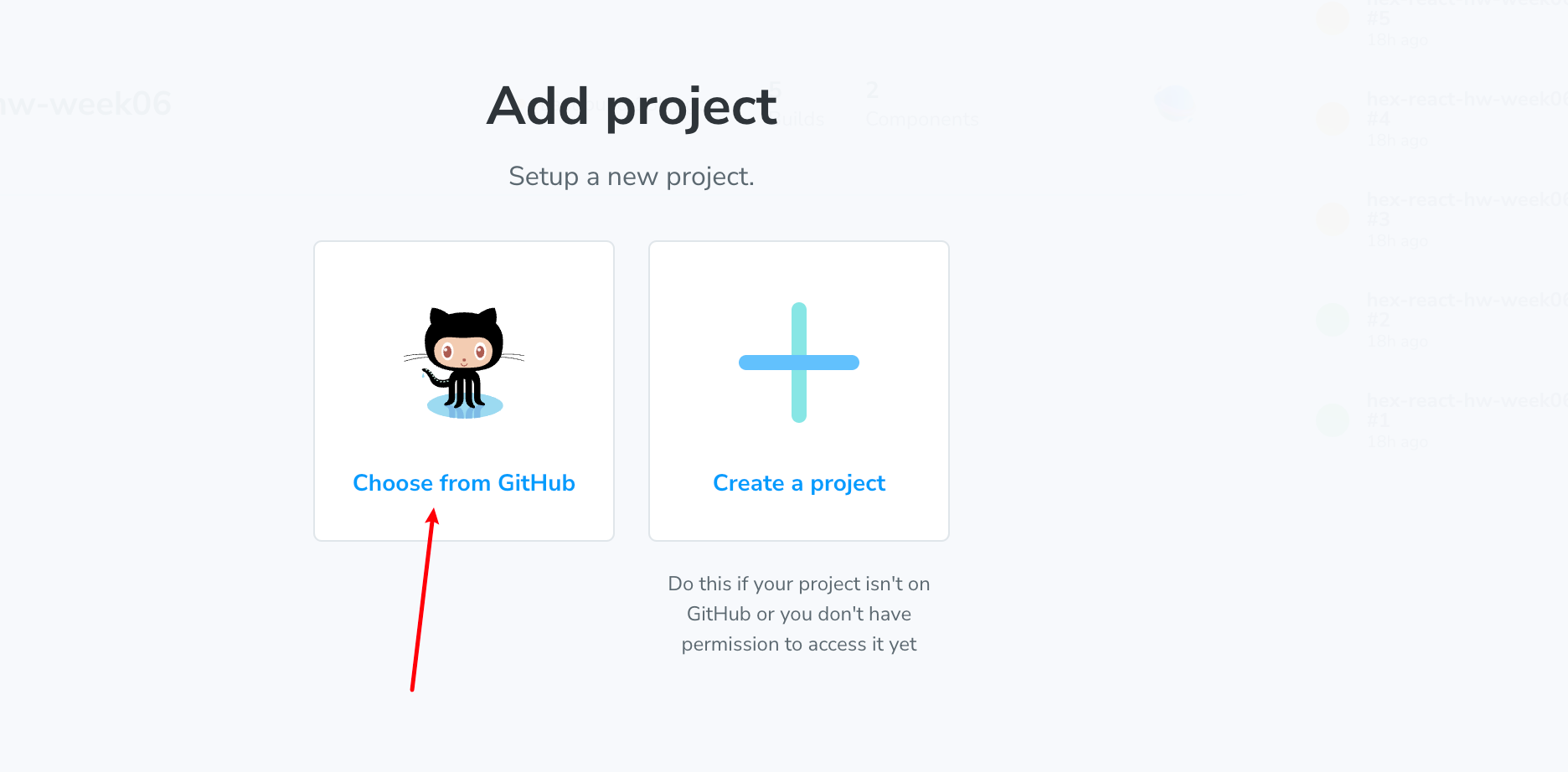
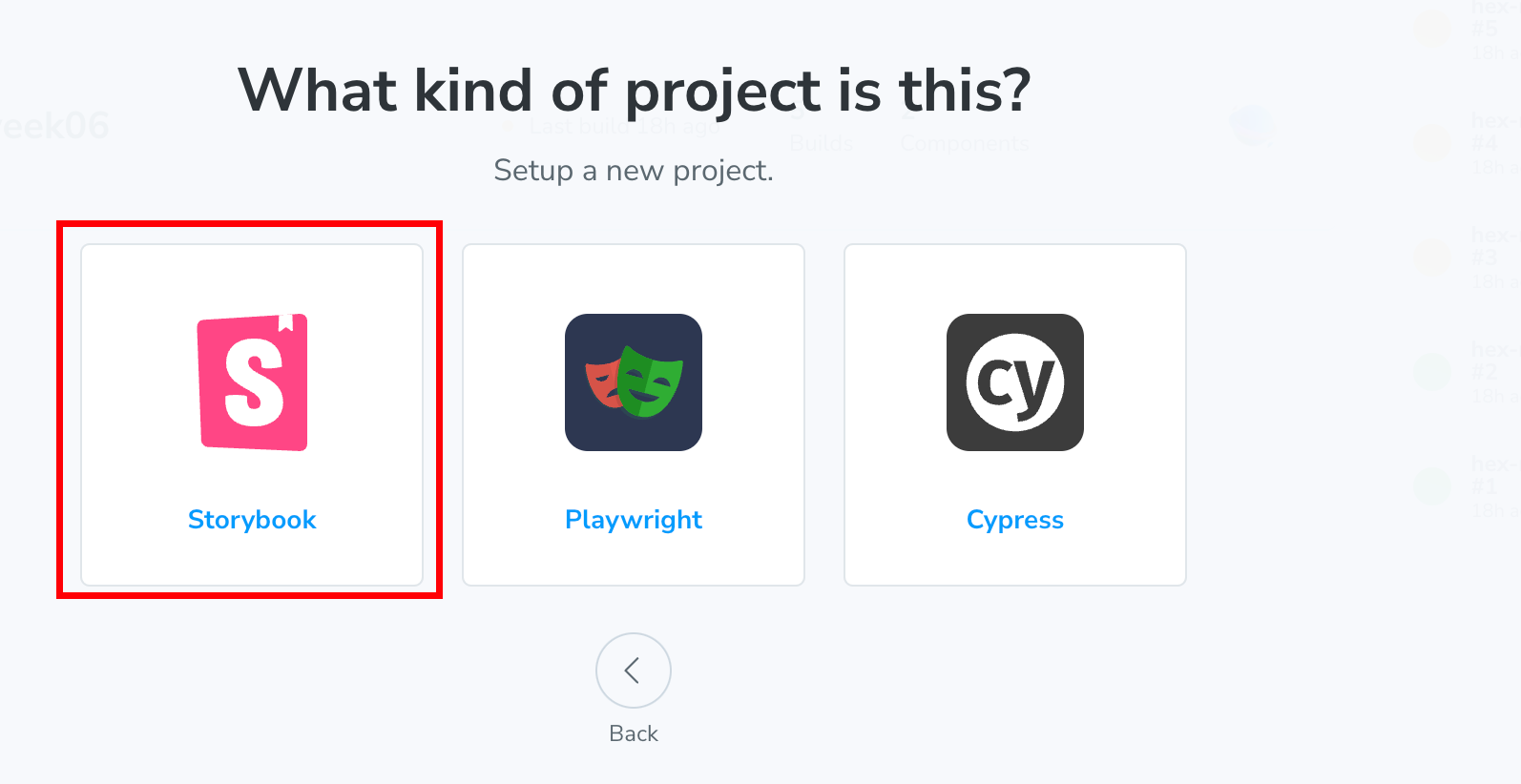
3. Login Chromatic with your github account and choose the github repo
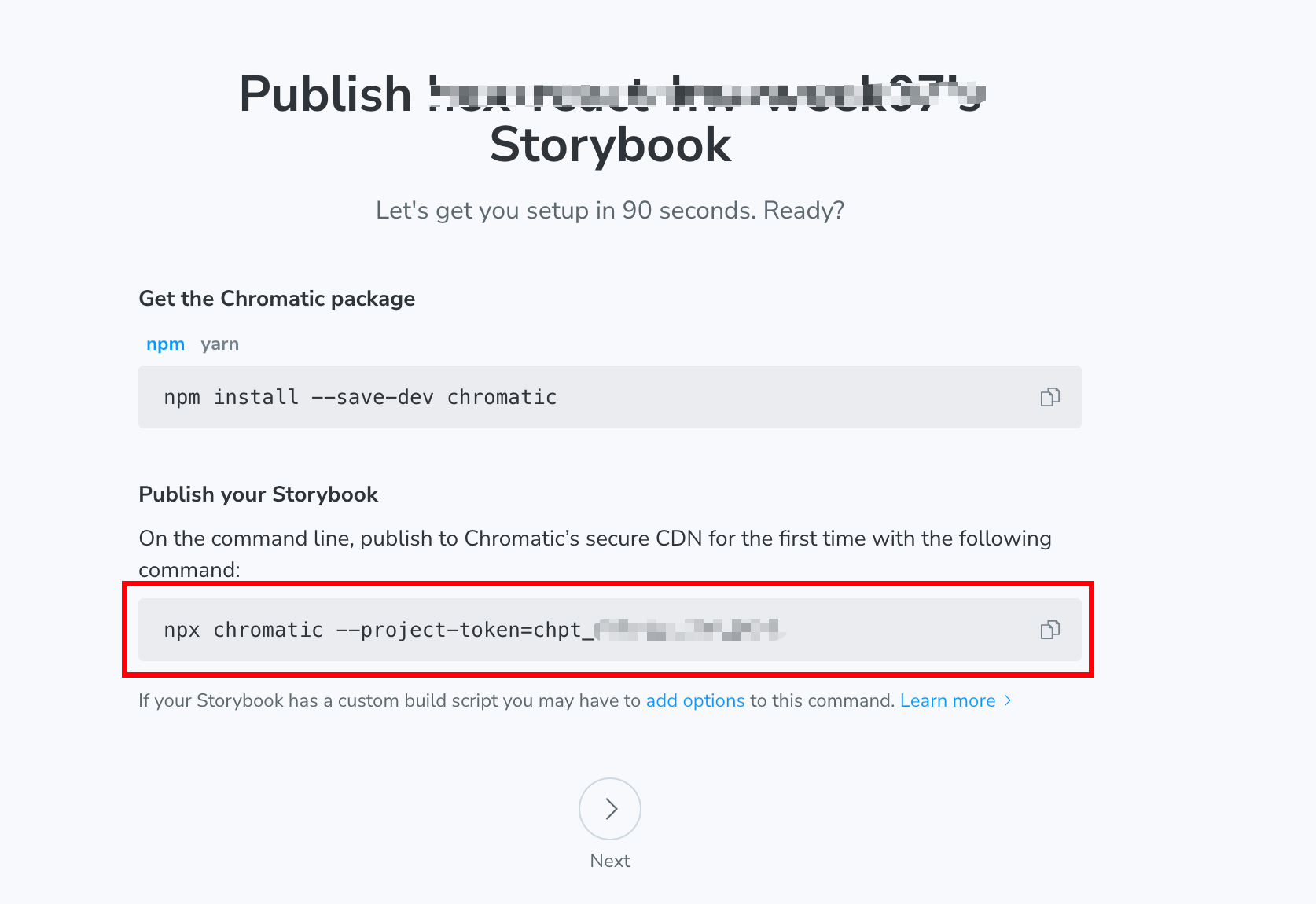
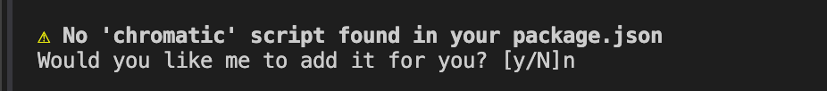
4. Add Chromatic to your project by typing "npm install --save-dev chromatic" in your terminal
5. Follow the instruction and type in the command to the terminal
6. Now, you will have a link that enter into your storybook
Step 5 - Continuous deployment with Chromatic with github action
We could set up a github action to help us to publish the change automatically when we have any changed on the `stories` folder
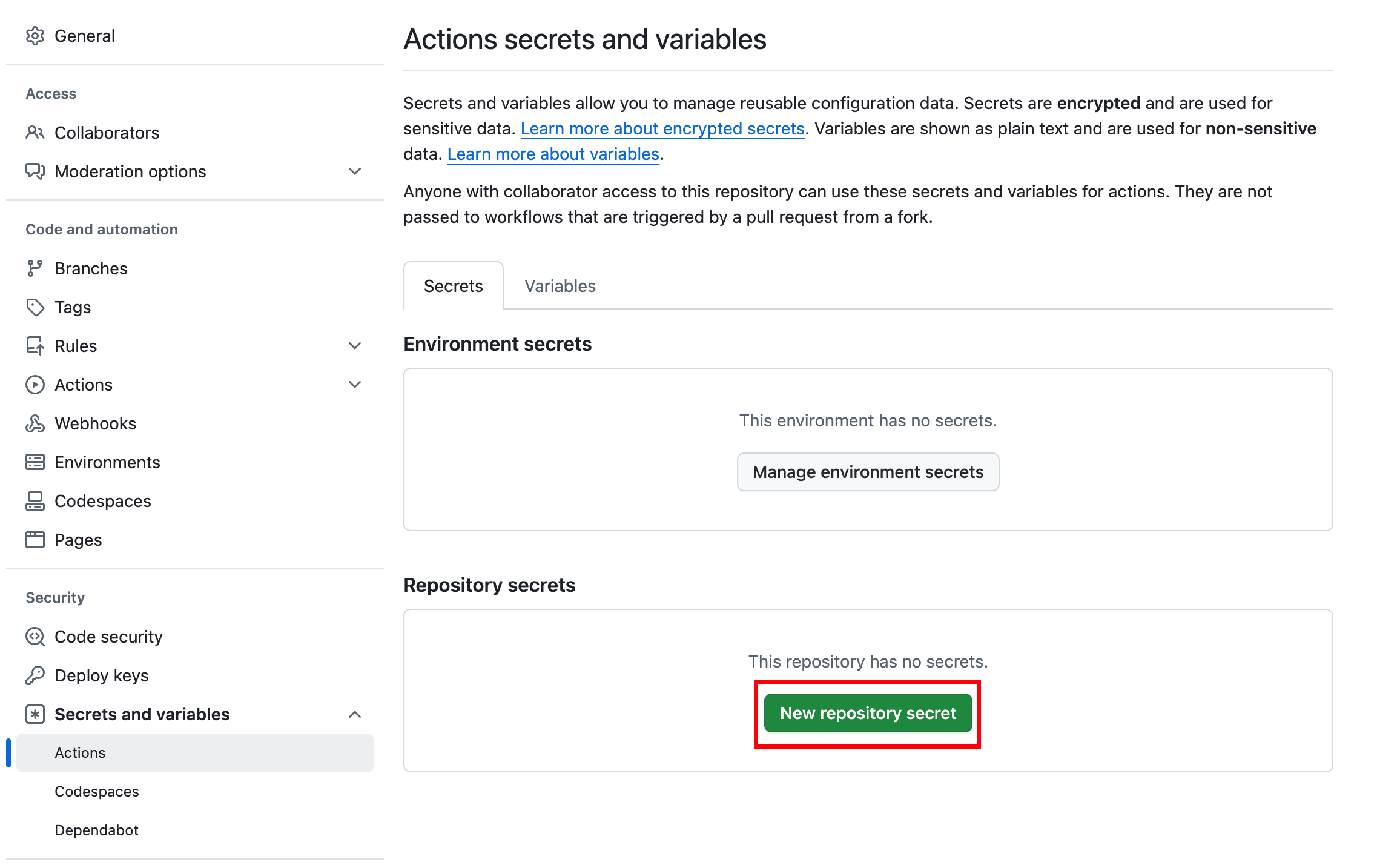
1. Go to your github repo > settings > secrets and variables > actions > New repository secret
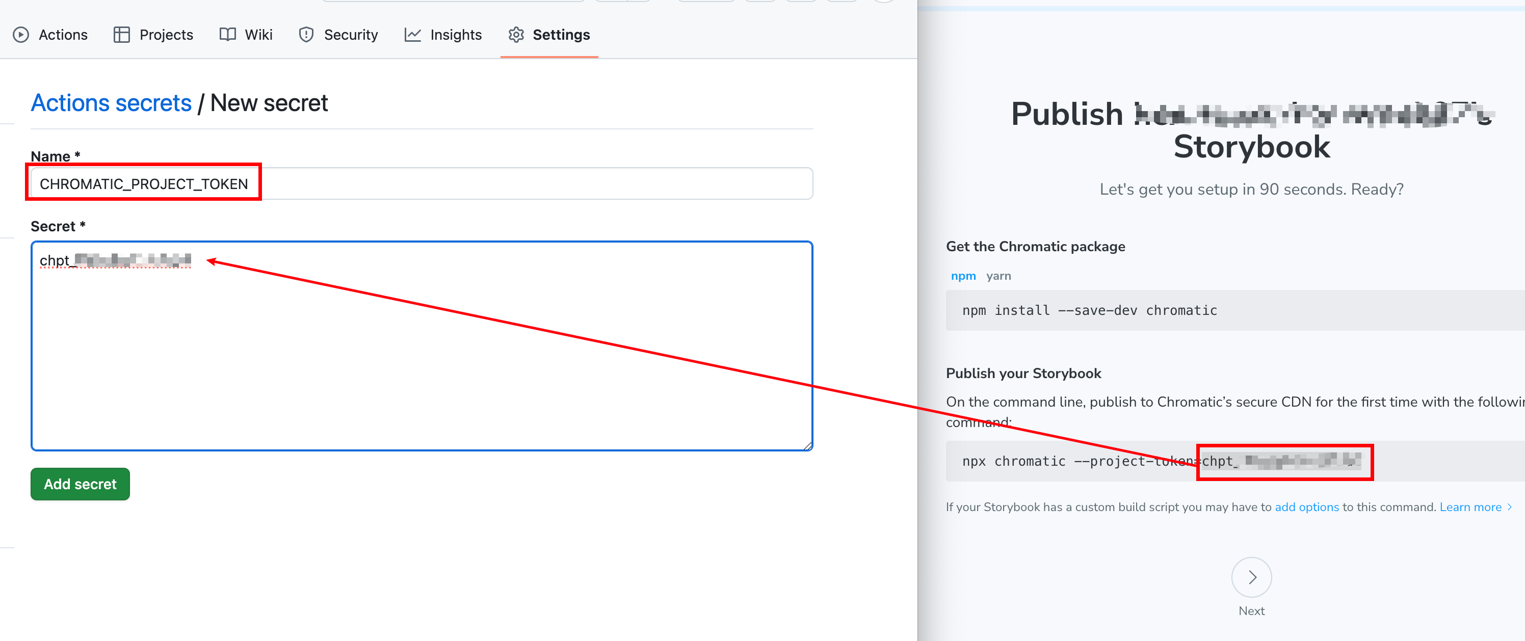
2. Put "CHROMATIC_PROJECT_TOKEN" as the name and the chromatic project token inside the secret
3. Create a new folder ".github/workflows/chromatic.yml"
4. Copy the below script to the "chromatic.yml" file
1# Workflow name
2    name: "Chromatic Deployment"
3
4    # Event for the workflow
5    on:
6      push:
7        paths:
8          - "src/stories/**"
9
10    # List of jobs
11    jobs:
12      chromatic:
13        name: "Run Chromatic"
14        runs-on: ubuntu-latest
15        # Job steps
16        steps:
17          - uses: actions/checkout@v4
18            with:
19              fetch-depth: 0
20          - run: yarn
21            #👇 Adds Chromatic as a step in the workflow
22          - uses: chromaui/action@latest
23            # Options required for Chromatic's GitHub Action
24            with:
25              #👇 Chromatic projectToken, see https://storybook.js.org/tutorials/intro-to-storybook/react/en/deploy/ to obtain it
26              projectToken: ${{ secrets.CHROMATIC_PROJECT_TOKEN }}
27              token: ${{ secrets.GITHUB_TOKEN }}